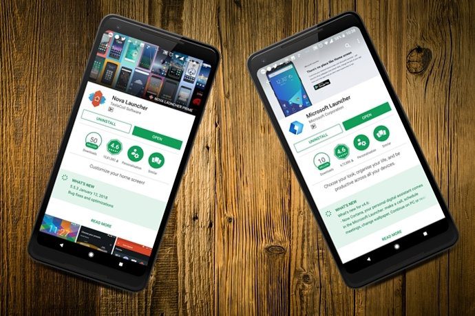
Yes, these wallpapers were made using cutouts, acrylics and a lot more – with the process taking around two days to complete. Thus, whether it’s the wallpapers or the layout of your home screen, a lot of effort goes into planning the correct picture and the right layout. So, when a phone like Google Pixel 2 comes up with a whole new home screen design and a promise to boost productivity levels (in search), it’s all but natural that you’d want to emulate this look on your Android. The good news is that you can get the Google Pixel 2’s look on your Android easily with the help of the Nova Launcher. Though it requires a few setups and a little amount of time, I bet that you’ll love the end result.
1. Get the Wallpaper
The first and foremost step is to get hold of the background wallpaper. We have a chaotic street in a rainy evening and yet, everything is moving forward. The Google Pixel 2 is marketed as a one-stop solution for all your needs and this fact gets perfectly reflected in the default wallpaper. Well, I’m sure this isn’t the only interpretation of this picture.
2. Ditch the App Drawer Button and the Page Indicator
At a time when swipes and gestures have replaced the majority of the mundane tasks and buttons, it’s natural that the Pixel 2 home screen calls in for the removal of the App Drawer button and the Page Indicator. In Nova, removing the app drawer button is easy as removing an app. A long-press is all it takes for the option of Remove to pop up. As for the page indicator, head over to Nova Settings > Desktop and tap on Page indicator. Select None and you are done. Meanwhile, you’d need an alternate means to access your apps. For that, head over to App & widget drawers and toggle the switch for Swipe to open. Having done that, a simple swipe up will reveal all the apps.
3. Lower the Search Bar
Pixel Launcher, which came to the market last year, made quite an impression with the newly designed Google search pill and the weather widget. This year, Google has ditched both of these gimmicks for a more productive search bar at the bottom and a smaller weather indicator. Just in case you have the square version of the search bar, head over to the Nova Desktop Settings > Search bar style and select the first option. The same goes for the Logo Style. Scroll further down and select the colorful G icon. Now all you have to do is head over to the home screen, long-press on the bar widget and drag it down.
4. Adjust the Desktop Grid
If you’re like me, then I am sure you favor a clean home screen. With all the gestures and hidden tricks that Nova has up its sleeves, it makes achieving a clean look very easy. The standard look comes with a Google folder, with the important apps lined up beneath it. So, the next step would be to ungroup these apps and arrange them as per your wish. However, before you proceed, make sure that the desktop grid is set accordingly. The new Pixel 2 screen packs in five icons set side-by-side, hence, the grid needs to be set as 5×5.
5. Get the Pixel Icon Pack
Once the icons are arranged, get the Pixel look by adding the power of the Pixel icon pack. Currently, there are two viable options — the paid Pixel Icon Pack – Apex/Nova/Go available for Rs 60 (roughly $1) or the free Pixel Icon Pack-Nougat Free UI by Saurabh Gupta. Once downloaded, all you have to do is (you guessed it right!) go to Nova settings > Look & Feel and import the icon pack.
6. Get a Clock Widget
Last but not the least, it’s time to get a fancy clock widget. While you can get your hands on any widget from the Play Store, I found the Clock Widget from MasMas studio to be the perfect fit. All you need to download the app, drag a widget to the home screen and customize the settings accordingly.
Finishing Touches
So, that’s how you can have the Google Pixel 2’s look on your Android. The above steps will emulate the Pixel’s looks, however, you might want to make the below adjustments as per your taste.
1. Bridge the Gap with Dock Overlay
The Dock as Overlay button will minimize the width between the search bar and the apps and will streamline the look on your screen so that whenever you are swiping up, the App Drawer will open instead of the Google Search. To enable it, head over to the Advanced Dock settings and toggle the switch.
2. Icon Padding
Similarly, you can lower the icon padding. The ideal measurement is None for Height padding and Small for Width padding.
All Pixelated?
So, whether it’s a phone featuring a stock Android experience like Xiaomi Mi A1 or a feature-rich phone like Samsung J7 Max, it’ll barely take a few minutes to set this up. See Next: Google Smart Gadgets Pave the Way for an Exciting 2018 So, will you transform the looks of your Android phone? We’d love to hear what you think! The above article may contain affiliate links which help support Guiding Tech. However, it does not affect our editorial integrity. The content remains unbiased and authentic.
![]()

![]()
![]()
![]()
![]()
![]()
![]()
![]()
![]()
![]()
![]()
![]()
![]()

![]()


